Features:
- Market commentary
- For Sale vs. Under Contract
- Sold vs. Expired (last 6 mos.)
| - Average DOM (Sold vs. Active)
- Average Sold Prices
- Average Days on Market Sold
|
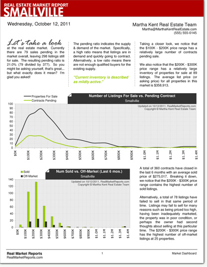
Chart 1: Number of Listings For Sale vs. Under Contract
This is a comparison chart that breaks down the market by price range. It is a graphical representation of the pending ratio. In other words, it allows you to conveniently and quickly locate activity in the market.
Chart 2: Number of Sold vs. Expired (Last 6 mos.)
This shows the number of sold and expired listing over the last 6 months, again broken down by price range.
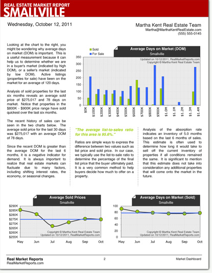
Chart 3: Average Days on Market (DOM)
This is a useful measurement because it can help us to determine whether we are in a buyer's market (indicated by high DOM), or a seller's market (indicated by low DOM).
Chart 4: Average Sold Prices
The recent history of sales for the last 6 months is shown in this chart. Average prices are plotted across the graph along with a 6 month average line which allows you to determine the current trend.
Chart 5: Average Days on Market (Sold)
Just like in chart 4, this chart shows sale for the last 6 months. This time, however, it shows the average time the property was on market before closing. Again, the current trend can be determined from this data.
Detailed Sample:
Download a free sample here:
Smallville.pdf
This is an example of how your report might look when you order the Chart and Commentary Add-On. If you don't have Adobe Reader installed on your computer, please download the latest version for free at
https://get.adobe.com/reader.
Screenshots:

